Better UX Design Would Have Saved Citibank $500 Million
Citibank committed one of the “biggest blunders in banking history” when it accidentally wired $900 million in payments last year to Revlon’s lenders, when it only intended to send $7.8 million.
While some good samaritan lenders returned the extra payments, others did not, leaving a $500 million deficit in the balance. What’s more, a judge this month ruled that Citibank isn’t entitled to that $500 million, so what was a user error is now a complete company loss.
Ars Technica summed up how the mistake occurred in the first place: “Kludgey software and a poorly designed user interface contributed to the massive screwup.”
They’re somewhat right. But poor user experience (UX) didn’t just “contribute” to the screwup; actually, it was the whole screwup. After studying the details of how this mistake was made and how it successfully made it through two reviews, it is clear that this mistake was entirely due to a poorly designed user interface.
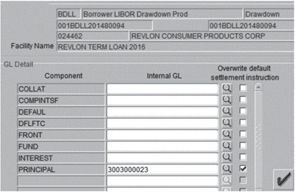
The problem lies in what the users thought they were doing through the software (sending the principal of the loans to an internal wash account) and what they were actually doing (paying off all of the loans, including principal). The failure is actually much bigger than just the screen where the mistake happened.
Good UX is About More Than Just Functional Elements
Most companies that build software think user experience is just about the functional elements. In other words, as long as there are buttons for all the actions the user can make, it’s “good enough”. When you build to a “specification”, this is particularly common. Because the quality of the user experience is subjective, even if the specification says the software should be usable, it’s hard to measure the level of usability.
User experience design requires knowledge of how the software will be used and what the user knows already (or doesn’t know). It should also give the user clarity about what’s going to happen when there are high stakes actions.

The team that built the screen above may have had a “UX person” on it, but the quality of the user experience was clearly considered low priority.
How Citibank Could Have Provided a Better User Experience
To illustrate the difference, let’s consider those “Are you sure?” pop-ups after you hit “submit” or some other action button. If it pops up for something you don’t care about, then it’s just an annoying extra click. If, however, the action you’re about to take is irreversible and can have major consequences, then the “Are you sure?” pop-up is a helpful catch point.
Even better would be a box that asks, “Are you sure?” and then explains the consequences of saying yes – a recap of what you’ve told the software to do. This kind of catch point would be a lifesaver for major transactions like the one at Citibank. Good user experience design seeks to know the difference by getting into the mind of the user, their context, and the relative importance of the action they are taking with the software.
Final Thoughts
UX isn’t about just completing the feature; it’s about building a product that consistently adds value to its buyers and users. Insightful user experience is a prerequisite for a product to do so. And it doesn’t have to cost a lot either. Better UX could have saved Citibank $500 million.
At 3Pillar Global, we believe that the quality of the user’s experience is not just the domain of the UX team members. The entire development team needs to have a Product Mindset and understand the “why” behind the design. Each member of the team should care about the quality of the product and the end user’s experience. In our work for clients, it’s not uncommon for a developer to say “this doesn’t make sense to me” or for a tester to point out that they had a hard time completing a task or found it potentially confusing. And ultimately, this emphasis on outcomes and adaptability at every stage creates products that better serve users and generate more value for our clients.
To learn more about empowering global team members to design for the end user, click here for a download of “The Product Mindset” book or shoot me a note at scott.varho@3pillarglobal.com.
Recent blog posts

Stay in Touch
Keep your competitive edge – subscribe to our newsletter for updates on emerging software engineering, data and AI, and cloud technology trends.


