Understanding the Data in Data Science
The most time-consuming aspect of any data science project is the transformation of data to a format that an analyst can use to build models. This is more critical for parametric models, which assume known distributions in the data. However, even before you begin to transform the data, you need to understand it.
What does it mean to “understand” data? The objectives of data understanding are:
- Understand the attributes of the data.
- Summarize the data by identifying key characteristics, such as data volume and total number of variables in the data.
- Understand the problems with the data, such as missing values, inaccuracies, and outliers.
- Visualize the data to validate the key characteristics of the data or unearth problems with the summary statistics.
In this post, I will explain each of these objectives.
Data Attributes
For starters, you must know the variables in the data. A variable consists of two parts – the label and the data type. Data types can be numeric (integers, real numbers) or strings. The data type can sometimes be tricky; for example, US postal codes are numeric but need to be treated as strings. Once the labels and data types are known, you can group attributes into two kinds for modeling:
- Continuous Variables: These are numbers which can range from negative infinity to positive infinity. You would associate with the labels a sense of magnitude, maximum and minimum. You can sort on such variables and filter by ranges.
- Categorical Variables: These variables can have a limited set of values, each of which indicate a sub-type. For example, Direction is a categorical variable because it can be either North, South, East, or West. You can filter on or group by a specific value or values of a categorical variable.
Some string data (like the names of people) can be transformed to either a continuous variable (length of the name) or a categorical variable (first letter of the last name). You can also transform a continuous variable into a categorical variable by binning. Binning means taking a continuous variable and putting it into a discrete interval based on its value; the intervals can be treated as values of a categorical variable.
Key Characteristics and Outliers
Once you have identified the variables of interest, summary statistics help you understand the nature of each variable. The common summary statistics are mean, standard deviation, skewness, and kurtosis.
Mean
The mean (µ) is a measure of central tendency of a distribution or discrete set of numbers. In the latter case, it is the sum of all values divided by the count of values. The mean is a good measure of the central tendency when the distribution is normal or uniform, but this is not true of all cases. The mean by itself is a misleading statistic as it gets distorted by very low or very high values (outliers) and should be reported with the standard deviation.

Standard Deviation
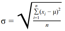
The standard deviation (σ) is a measure of the spread of the distribution. The larger the standard deviation, the bigger the spread. For a discrete set of values, the standard deviation is calculated as the square root of variance. Variance is calculated by dividing the sum of squares of the difference of each value and the mean, with the total number of values. The standard deviation is considered in the context of a normal distribution.
Normal Distribution
This is a very common distribution that is observed in many natural phenomena. The Bean Machine is a famous exhibit that demonstrates this phenomenon. In the Bean Machine, balls are dropped from the top, bounce randomly as they hit the pins, and collect at the bottom into a normal distribution of heights. Normal distributions have some additional properties:
- The distribution is symmetric.
- The mean, median, and mode are all the same value.
- The approximate data distribution around the mean with increasing standard deviation are:
- 68% for +/- one standard deviation
- 95% for +/- two standard deviations
- 99.7% for +/- three standard deviations
- The data points outside of three standard deviations are considered outliers as they are very unlikely to occur.
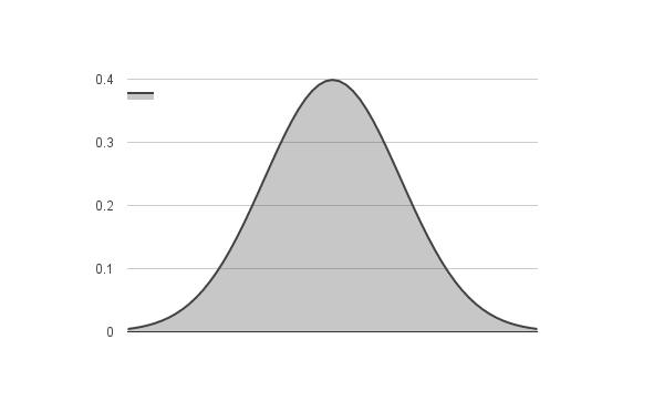
In order to check if the variable follows a normal distribution, you need to know its mean and standard deviation. You can then use a normal distribution function to get the probability of each value of the variable in the sorted set. If the distribution is indeed normal, you will get a plot that is close to the following figure:
Normal distribution with = 0 and =1
Skewness
Skewness is a measure of the balance of the distribution. A normal distribution has a skewness value of 0 (zero). Positive skew (value greater than 0) indicate a tail on the right side of the distribution, while negative skew indicate a tail on the left side of the distribution. Negative skewness is observed in distributions with outliers less than the mean, while positive skewness is observed when there are outliers greater than the mean. Significant skewness indicate that the mean and standard deviation are not good measures of the distribution.
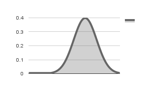
Negative Skew
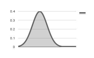
Positive Skew
Kurtosis
Kurtosis is another measure of the shape of the distribution. Kurtosis for a normal distribution is 3. Kurtosis higher than 3 indicates that the shape is thinner than a normal distribution and a kurtosis lower than 3 indicates that the shape is flatter than a normal distribution. Kurtosis is important because it may present problems with the data even when the distribution is symmetric. For example, a distribution may have long symmetric tails on both sides, with a sharp peak – this indicates that the mean and standard deviation are not good measures for the distribution. Some statistical packages report excess kurtosis, which is the difference of the kurtosis value and kurtosis for normal distributions (3). In this scale, a positive kurtosis indicates a thinner distribution, while a negative kurtosis indicates a flatter distribution (both relative to a normal distribution).
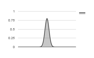
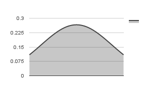
In addition to the normal distribution, some other well-known distributions are:
- Log Normal – Sometimes, the log of a set of values have a normal distribution. To check this, you can plot the normal probability distribution of the log of the values.
- Pareto – Pareto distributions also occur in nature and has been used to describe the distribution of wealth in the world. If your data has a Pareto distribution, you will get a straight line by plotting the CCDF on the log-log scale.
- Exponential – These distributions are observed within the time intervals between events that are likely to occur any time. Similar to the Pareto distribution, if your data has an exponential distribution, the CCDF plot on log-log scale will be a straight line.
If, after an examination of a variable for known distributions, the variable does not satisfactorily fit any distribution, it is necessary to look at rank-ordered statistics.
Rank-Ordered Statistics
The measures we’ve seen so far are heavily influenced by the presence of large outliers. Rank ordered statistics overcome this issue. If the variable is sorted and associated with a percentile rank, insights can be gained regardless of distribution shape. The most common rank ordered statistics are:PercentileMetric0Minimum251st Quartile50Median753rd Quartile100Maximum
The Inter Quartile Range (IQR) is the difference between the 75th and 25th percentile values. A larger IQR indicates more variation in the data. This is a robust statistic that is not affected by large outliers. It can be used in lieu of standard deviation for distributions that are not normal.
Visualization of Single Variables
Visualization of a variable helps in obtaining insights into the distribution of the data. The two common visualizations for single variables are a histogram and a box plot.
Histogram
A histogram depicts the shape of the distribution by binning the values into discrete intervals. The intervals create the x-axis and the number of values in the interval create the y-axis. A histogram is a good indicator of the symmetry of the distribution, skew, and kurtosis.
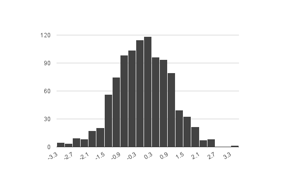
Box Plot
A Box Plot represents quartile statistics. The box represents the IQR, and the median is a line cutting the box in half (or close to it). A box plot can also have whiskers, which typically represent the upper quartile boundary and lower quartile boundary – this is known as a box and whiskers plot.
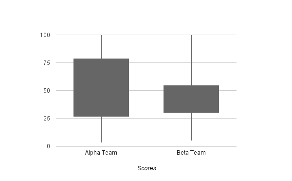
This is a box plot of the test scores of two teams (Alpha and Beta). The IQR for the Alpha team is much higher, which indicates a large variation in the test scores, versus the Beta team. The y-axis is the percentile range.
Conclusion
I have not talked about fixing outliers in this post, but only detecting their presence. Additionally, there are other statistics (like correlation and covariance) that come into play when you consider multiple variables. Such topics deserve posts of their own and will be covered in the future. I hope this post enables you to begin your data exploration one variable at a time.
Recent blog posts

Stay in Touch
Keep your competitive edge – subscribe to our newsletter for updates on emerging software engineering, data and AI, and cloud technology trends.

